I am here with yet another bookish pet peeves post. You’d think that I’d manage to exhaust the list of things that annoy me in 3 posts (1, 2, 3), but you were wrong.
Inconsistent covers in a series
I don’t mean covers that don’t match. I already ranted about that in one of my previous posts. I mean when the covers do match, but they are inconsistent from one book to the other. Let me illustrate what I mean with a picture.
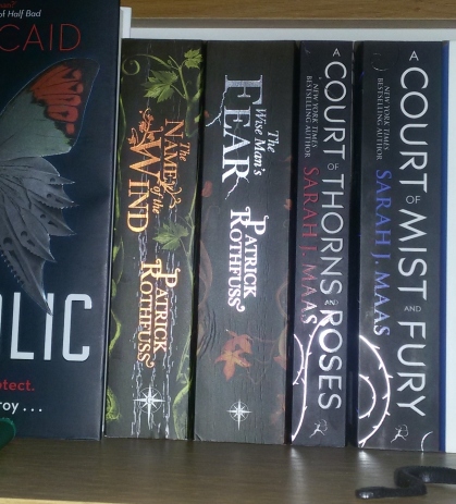
Our subjects are The Name of the Wind and The Wise Man’s Fear. The front of the covers are nice and matching, the spines match as well, the font matches. But why, why couldn’t they have placed the titles in the same place on the spine? The books are the same height. WHY? And why did they have to make the publisher’s logo bigger on one than on the other? Why would you do that? Who has hurt you so badly that you feel the need to inflict pain indiscriminately?

When the formatting is inconsistent
You may have realised that I don’t like inconsistency. It bugs me to no end. So when the formatting inside the book is not consistent, it drives me bananas! Allow me to show you some more pictures.
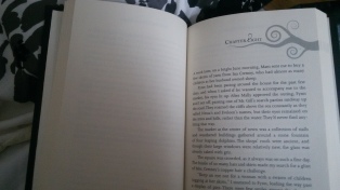
Why? First of all, why would you leave a blank page at the end of the chapter? You are the reason koalas are sad.
But if you’re going to do that, at least do it consistently. Don’t go back and forth. I will spend more time feeling annoyed at this than I will pay attention to the book. Just don’t.
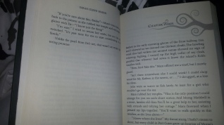
Also:
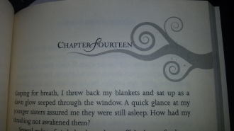
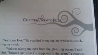
This isn’t really noticeable in the picture, but the swirly thing is in different places on the page. It’s higher up on the page for chapter fourteen than it is for chapter twenty four. Also, why is the “F” in fourteen loopy and the “F” in twenty-four not? Why isn’t the first letter of every word loopy, for that matter?

The shiny paint on titles
Now, I have nothing against the shiny paint in and of itself. But what really annoys me is that that shit is like butterfly wings. You touch it and it dies. Look at this
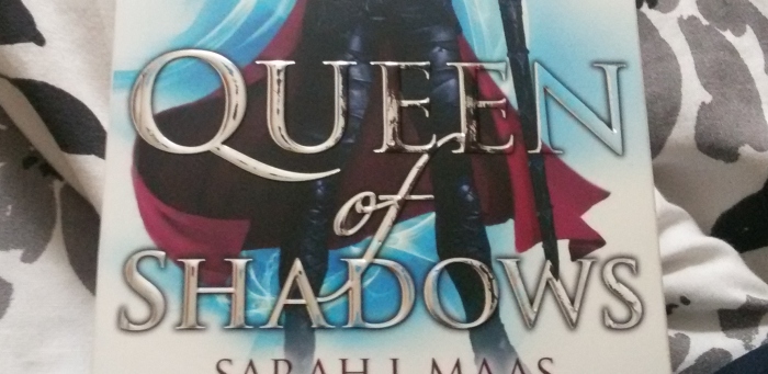
Believe me when I tell you that I handled this book like it was made of crystal. You can’t even see any creases on the spine. I checked every time I picked it up that my hands do not touch the title. I always made sure not to place it face down. And it did not take me more than 3 days to read. I don’t even think it took me that long. And still, half of the stupid shiny paint is gone. Just… ughhhhh!


SAME! Oh my god inconsistent spines or covers (or heights, those are the worst) bug me so much!
LikeLiked by 1 person
Right? I feel a small bubble of anger in my chest every time I see it!
LikeLiked by 1 person
Ah when covers don’t mach, it is the worst.
LikeLiked by 1 person
These are such small things that I thought I was the only one annoyed by them. Most people seem to have no problem with it. Good to know I’m not the only one!
LikeLiked by 1 person
That’s why the internet is great. You can always find people with whom you can complain!
LikeLike
I really dislike cover changes and spines that don’t match. It’s just….why put us through that…like why?! So not fair!
LikeLiked by 1 person
That page between chapters doesn’t really bug me, but different covers / spines (both height and design) really annoy me, because I want my books to look pretty on my shelf haha
I’m not a huge fan of shiny paint either, I have one book that I first read 4-5 years ago and that I re-read a couple of times after that, and you can BARELY see the title, because once the shiny paint comes off, it’s black, and the cover is ALSO BLACK!! -.-
LikeLiked by 1 person
The blank page is a complete waste of paper on top of the fact that the inconsistency of it just annoys me.
LikeLiked by 1 person