Top Ten Tuesday is a weekly meme hosted by The Broke and the Bookish. This week’s topic is book covers. I’ve chosen to tell you about 10 books that have covers that are simply discordant to their content. Whether the cover is beautiful and the book isn’t, or the other way around, or the cover simply has nothing to do with the book.
Caraval by Stephanie Garber

This book is gorgeous. Both the UK and the US editions are just so beautiful, I can’t even! But the actual story is absolute shit. I hated it so much, but it’s so beautiful that I’m never going to get rid of it. I have both a spoiler free review and a rant review of this, if you would like to know more about it.
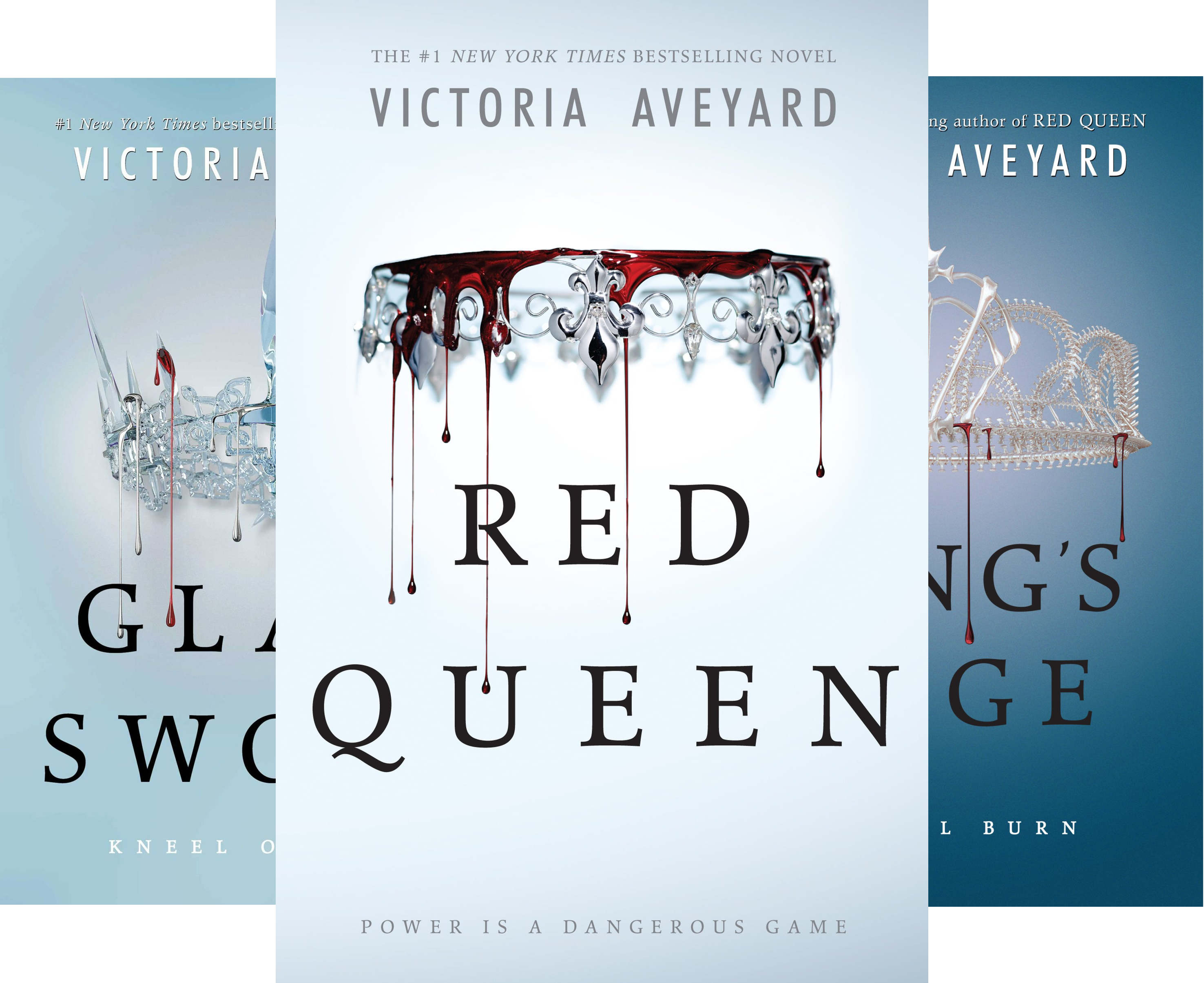
Red Queen series by Victoria Aveyard

Another one where the covers are beautiful, but the books are just not. Well, the first book was okay. I absolutely hated the second one. I obviously haven’t read the third one because I’m not subjecting myself to another book of rage and frustration, but yeah… I hated Glass Sword. You can check out my review of it if you are interested in knowing more.
The Sin Eater’s Daughter series by Melinda Salisbury

This series has such cool covers! And it’s so… boring. I’ve only read the first book, but it was so boring that I cannot imagine what happens in two more of them. I am telling you, this was a 250 page book of nothing happening.
The US Editions of the Daughter of Smoke and Bone Series by Laini Taylor

These covers don’t do the series justice. The UK covers are stunning, but I would not be interested in these books at all based on these covers. They’re kind of ugly. And they really don’t have anything to do with the plot. What close ups of girls wearing masks or makeup has to do with this? I don’t know. This series is so beautiful and the writing is magical and these covers just don’t reflect that.
Poison Study series by Maria V. Snyder

I know there are some other editions of the books, but these covers make no sense to me. To me, this looks like some period romance/court intrigue series. It’s not. These covers just do not reflect the content of the books at all, in my opinion. Based on these covers, I would never buy these books. They’re not necessarily ugly covers, but they speak to me of a genre that I’m usually not very interested in.
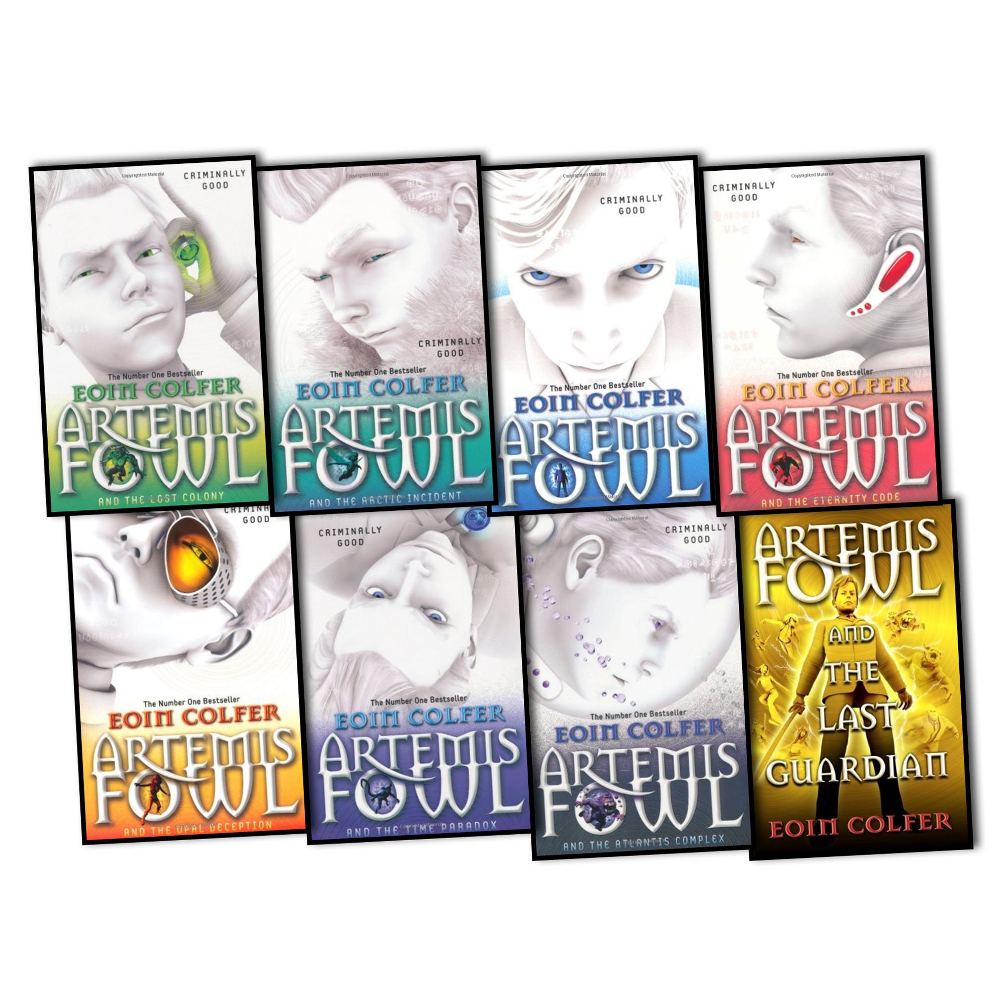
The Artemis Fowl series by Eoin Colfer

I don’t think this series has an entire set of matching covers. There are like 5 different cover editions at least and none of them are complete as far as I could tell. It’s so annoying. And what’s even worse is that all those editions are just varying shades of bad. The one in the picture is the edition I hate the most. It’s just so… bad. It does not do the series justice. The series is awesome! I want them re-released in a nice edition where they all match. Is that too much to ask?
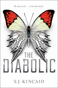
The Diabolic by S. J. Kincaid

It’s a really nice cover… I just don’t understand what a butterfly has to do with anything. I suppose the two halves of the butterfly could represent Sidonia and Nemesis, one soft and one sharp and serrated. But… why butterflies? They did that for Replica by Lauren Oliver as well. It’s like they have no idea what to put on the cover, so they just slap a butterfly on it and call it a day.
The Twilight series by Stephanie Meyer

Again, very aesthetic covers, just… what do they have to do with the books? I suppose the theme of black, white and red does capture the vampire-y, but why an apple, a petal, a ribbon and whatever else? Could have been some objects that reflect the story somehow? I mean, I like these covers. And they’re so iconic by now, that everyone would recognise them. But I just wonder what the thought process was when first printing this. “Hmm… so this is a book about vampires. It’s called Twilight… let’s put an apple on the cover.”
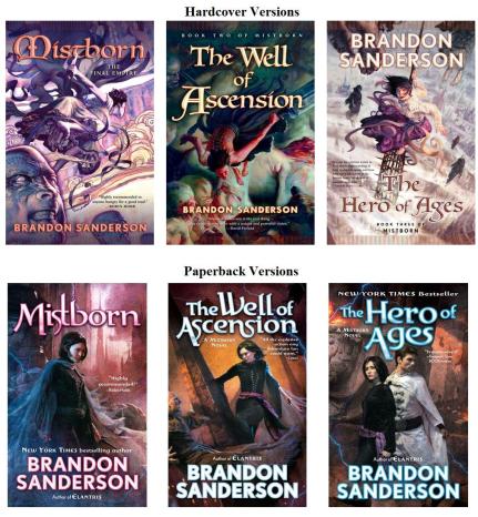
The US editions of the Mistborn series by Brandon Sanderson

Both the US hardback and the US paperback editions are just hideous. This looks like some shitty comic-book covers. They’re so, so ugly and this series does not deserve such ugly covers. Thankfully, the UK editions are really cool. I’ve only read The Final Empire so far, but it was so amazing, I can’t wait to read the rest of them. I have both a spoiler-free review of it and a rave review if you are interested to know more of my thoughts.
The US covers of the Kingkiller Chronicle by Patrick Rothfuss
![]()
These aren’t horrible, but they certainly don’t do the books justice. The UK covers are much better and I feel also capture the essence of the series much better. I absolutely adore these books, it’s one of my favourite series. I have reviews of both The Name of the Wind and of The Wise Man’s Fear, if you are interested.
Oh I totally agree with the Caraval covers, beautiful but the book inside is just a superficial mesh of pretty words. I have often wondered about the apple on Twilight… maybe the apple is like forbidden fruit or poisonous treat?
LikeLiked by 1 person
I don’t know. I think they just thought it looks pretty and since they had no better ideas, they went with the apple.
LikeLike
Great post! I absolutely agree with you on the Caraval one, the book cover is amazing but the story not so much
LikeLiked by 1 person
Yeah, such a let down!
LikeLiked by 1 person
I haven’t read Caraval or The are Queen series yet but those covers are gorgeous. Im sadyou didntlike Caraval, but i heard you eitger love it or hate it. I’ll probably borrow from library then.
LikeLiked by 1 person
Well? I definitely hated it.
LikeLike